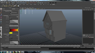
Wednesday, 12 January 2011

Final thoughts


Ok, so this is what I'm thinking by the end of our project.

Am I happy with the final outcome?

Kind of..

Why?

It could look 10 times better than it does.

Is there anything I would change? YES!

I would have taken out the entire point of view of the rat. Not because it was a bad idea but because the animation was rush in 2 days. That could of been used for rendering and perfecting any odd bits in the final render. A pan view through our street looking at the different features would have looked so much better as well as showing off the good work we did to it's maximum.

As it is, I feel the animation is waaaaay to fast and you can't take in any of the scenery. It just seems like a confusing blur to me as it is. I advised that we scrap the whole rat point of view just because it wasn't practical in the time we had left but it wasn't dropped and I honestly think it has let down alot of our hard work.

The only part that really works in my opinion is when the rat stops at the stalls and has a little look around. Other than that, I have to honestly say I feel kind of disappointed

One last thing as well. The rat gets really close to the building I textured and because of this, a texture overlay I put on the normal paintwork of the building looked pix-elated which annoyed me..The main reason I was annoyed?


Mine was the only house that was seen this close so I looks like my building wasn't well textured with hi-resolution images, which isn't the case. I guess what's done is done and all I can do is accept and improve.

Conclusion: I think we made a really impressive environment, with great models, textures and lighting, but it was spoilt by unnecessary animation.

Lighting

The lighting was all done by deon but I was a opinion giver in this process. We didn't want to have it too bright but at the same time things needed to be seen so some type of directional lighting was needed. The main thing that came to mind was a sunset, which would be the darkest time of day before nightfall.


Here we tried putting a brown/orange overlay on the lighting but it made everything look really muddy.


we then took it down a little bit and looked at the view outside. I think it looked really good, representing the dirty/dull look but at the same time, I felt it took away from the hard stone like feel needed to represent London streets.


We then tried a different type of lighting which gave a much better feel to the entire street but it felt a bit to intense so once again we took it down a notch and put a bit of colouring on it.


The outcome was this, which I really liked.


Here is a image of my room illuminated with the same light source, which I thought looked amazing. The only thing is that it's going to be kinda hard to replicate something like that inside the building.

Texturing Sarah's crate


The above are the two textures I used for texturing Sarah's crate, I found it quite easy to do as it was very well modelled as well as it being a simple faced object. I found that once the bump and displacment map was put on it, it looked very good in my opinion.


Texturing Deon's house


Here are the UV's that Dominique gave me to start texturing the house. It is pretty well mapped out, but the first thing that came to my attention is that there is a box of UV's in the corner. This worried me because there shouldn't be any missing UV's in my thought, but I was told to just delete them as they weren't necessary. I didn't believe that though so I left them in the corner and just put the rest of the buildings texture over it. 

In my opinion I would re-UV is but at the same time, I trust what has been said to me so I won't worry about them to much.


Texture - To get the wood work looking nice and realistic I decided to use the images I took while at the V&A museum. so every bit of wood work I used from my reference images in the to left hand corner. While doing this I had to sometimes put a colour overlay on certain wood work as it was a different shade but it came out very well in my opinion.


displacement map


specular map


Deon's house with my texture fully applied. The only thing I didn't like is that, the UV map was pre-made for me to texture by Dom but some UV's were not mapped. The outcome of this left the building with some missing UV's in some normally not so noticeable places but this is the building that is being scaled by the rat in our animation. Due to this, some of these missing UV's are shown, as well as some planes that have been doubled up underneath from when it was modelled by Deon. 

The entire process of me trying to texture this house took me a day and i AM happy about the outcome, I just wish that I knew these things before hand so I could work my way around them in the time I gave my self to do it.

I don't think that this reflects my texturing ability. I honestly believe that if I was texturing my own building that I used planes to create, and was made symmetrical. Texturing it would have been x10 easier and x100 better looking.

Am I happy with it once again? 

Yes but I know I can do much better with a model of better quality and my own mapped UV's

Tuesday, 11 January 2011

Texturing my room


All of the above images are what I used for my object textures. I thought it would make a lot more sense sourcing images of the real thing rather than trying to re-create them in Photoshop. 


All above images have been textured by my self and rendered in mental ray. I found that using the create UV's from camera tool was a very handy to use for texturing cube like images. Anything with 4 sides I pretty much found really simple to do once I got to grips with it. I looked at a few tutorials on-line outlining ways of texturing but this was possibly the most effective way I found to do it, selecting faces needed and projecting the image onto them.

I'm sure there is going to be a better way of going about doing it but at the same time, for this, it did me well.


I found that once I applied the displacement and bump maps with shaders, the wood works really started to look good. The grain really came to life and I feel proud of it.


Finished room without mental ray


This is the finished room with mental ray on. 

Modeling the room inside my house

All the objects I modelled below for the room inside my house, as we decided my house would be the one the rat starts off in, in our animation. 


I started off with the chair's and table as it was the centre piece of the room. This had apparently been done, or was in the progress of being done by Ollie but I decided that in the time scale we had, it needed to be sooner rather than later. Saying that in mind, the chair was originally based of Ollie's chair which she did send me but the group found it a bit to regal looking for the room we had in mind, so I designed a new one off it.


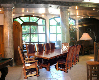
I based my table off this image here which I thought matched the idea of the group as well as the correct era of furniture.


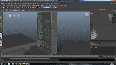
I then went on to create a bookshelf to follow the storyboard 


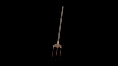
as well as  chest of draws and a pitchfork. To give the room some feeling of it being lived in at some point I decided to model the middle drawer coming out of the drawers.


The wooden planks were once again to add a scenery object as well as and obstacle for the rat to go over.


 I got this idea from and image posted on the group blog by Ollie I think.


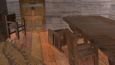
Finally a view of my room from the outside of my house. It just needs to be textured now!

Me and Deons music composition


This was initially inspired by Fable 3. A town named Bowerstone, of which much inspiration from the group has been founded. The main idea behind this is to just give some mood to the animation.

The pizzicato strings to represent the small movements of the rat
The horns represent the scene as a whole.
The bells set the scene, as it rends to represent a church or a bell tower (London)
The long held strings represent the scaling of the building as the rat climes and gets higher and higher.

As a whole e and Deon tried to represent the story in our head

The only problem is that this was done before the animatic had been complete, so we just had to time it as well as we could. Baring that in mind, I think it fits well.


Friday, 7 January 2011

Modelling my building


This is the reference image for the start of modelling my house. I took this from a selection of images some of my group members posted on our blog. 


I started off my building by using a single plane sized (9 x 10 meters)  and duplicated it 3 times to create my walls. I measured out these measurements with the group at uni, to make sure we all had the same scale of buildings.


I then selected the front face and extruded it outwards to give the separate floors. I wanted to keep the levels quite close to the same ratio so I matched the subdivides to the meters of the house. I also had to make the buildings taller as the plane wasn't long enough.


Once done, I started to work out where the details would be as well as subdivide the top of the plane to create the roof.


I then made a plane and matched it to the building by snapping to the vertices of the buildings top.


I worked into the windows by extruding them inwards after i subdivided them to give them a bit better shape.


Once the window was complete, I applied a blinn to them and reduced the transparency. I also applied a slight blue tint to it. this wasn't necessary but at the same time, it gave me a better idea of how my building would look from the outside in.


I continued this process onto the next level of my building to create the next window.


Here I subdivided the front of the building to create the details of the woodwork. I then selected the faces so that I could extrude them outwards.


Ater the first extrude of the panels, I then selected the thicker beams to extrude them out once again to give the effect of wood being layered/combined to create the frames for the building.


Afterwards I used the same method to create a window panel on the lower floor.


And once again I continued this on to the front of the roof.


The last thing left to model was the roof. I already had a roof in place but It was flat, so I decided to split it down the middle and delete one half. I then carefully extruded faces out while matching vertices so that each tile layer was the same length. I did this by temporarily adding reference points in between tile layers then deleting them after when extruding.


After this I mirrored the geometry across the -x while merging the vertices to complete my roof. After this was done my building was pretty much complete in terms of modelling.

I could have modelled the sides and back of the building with details as well but I diddnt feel it would be nessesary as it wouldnt be seen in the animation. Also even if the building was seen, It would be so close to another one that you wouldn't see it.
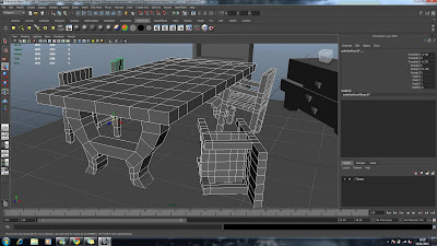

Here is my house fully modelled by my self. Deon then volunteered to texture it while I began modelling inside of it.


This is a image of my house in the street it self.

Reflective point? I have to say I am really proud of my house. Out of everything so far, this is a high. I think that I may even go back to this house and re-texture it my self at a later date for my show reel.